Redesigning the Corporate Engagement Experience

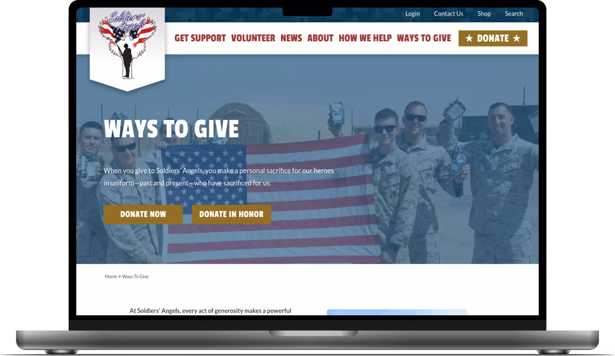
Client: Soldiers' Angels

Role: UX/UI Designer & Developer

Timeline: 4 weeks

Mockup of the Corporate Engagement Opportunities hero section for Soldiers' Angels.
Mockup of the Small Scale Engagement Opportunities section for Soldiers' Angels.
Mockup of the Large Scale Engagement Opportunities section for Soldiers' Angels.

Overview

Soldiers' Angels is a nonprofit that supports activemilitary, veterans, and their families.
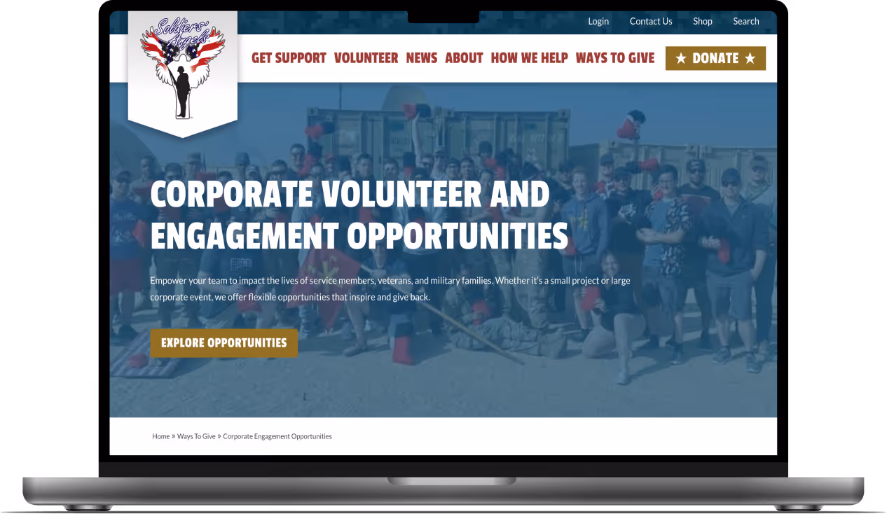
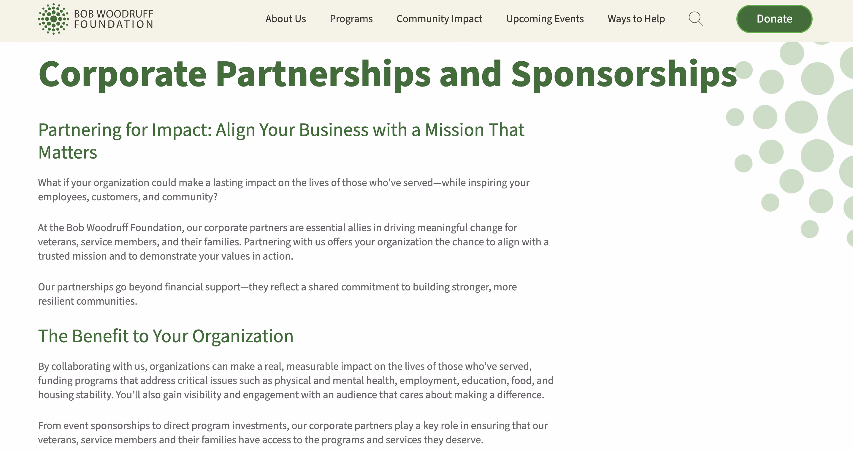
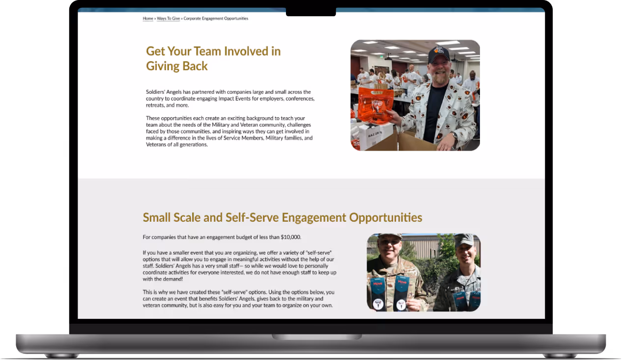
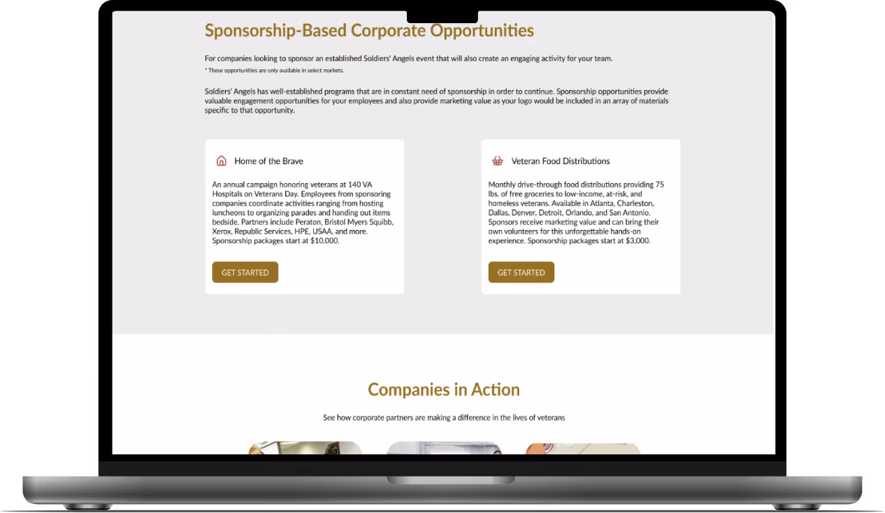
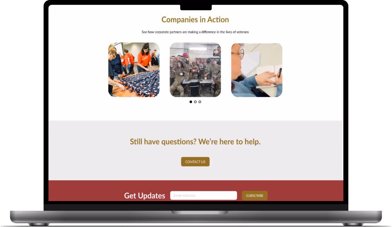
View live page

The Challenge

The Corporate Engagement page’s unclear structure, terminology,and navigation make it difficult for users to find relevant opportunities,leading to low engagement and limited tracking.

The Solution

Redesign the page with clear language, improved CTAs,and a simplified layout that integrates key content, captures user information,and enhances engagement tracking.

Stakeholder Interview

I met with the Marketing VP to understand the page'sperformance and redesign objectives.

Key Takeaways

  • In consistent terminology and page structure create friction in the user journey, making itdifficult for companies to find relevant engagement opportunities
  • Replace the accordion design with a clear, visible layout and integrate both "Corporate Engagement" and "Company Volunteer Opportunities" for better clarity and SEO
  • Each opportunity type needs distinct, trackable CTAs to guide users and measure engagement by section

Audit Findings

What's Working

  • Multiple giving options for organizations
  • Three categories help users quickly identify relevant opportunities
  • Fully responsive layout with all interactive elements functioning properly

Key Issues

  • Multiple CTAs confuse users instead of providing clear guidance
  • PDF downloads compete with primary actions rather than supporting them
  • Important information hidden in accordions makes it difficult to assess options quickly
  •  Lack of visual hierarchy and scannability reduces user engagement and action

Recommendations

  • Establish one primary CTA per section with visually distinct secondary actions
  • Replace accordions with card-based layouts to improve scannability and option comparison
  • Reorder sections (Small-Scale first) and add a brief form to track engagement
  • Implement stronger visual hierarchy and engaging elements to guide decision-making

Competitor Research

I researched 3 direct competitors to identifystrengths and areas of opportunities. I analyzed the corporate engagementuser journey and priority features.

Wounded Warrior Project website featuring the corporate giving hero section.
Homefront website featuring the 'Become a Partner' section.
The Bob Woodruff website home page hero section.

User Persona

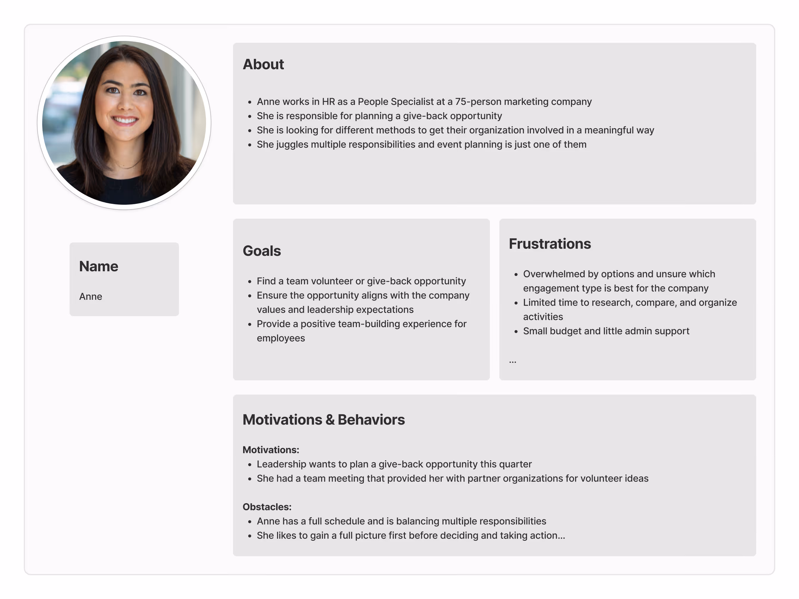
I developed a user persona to guide design decisionsbased on user needs, pain points, goals, and behaviors.

User persona diagram for Anne, an HR People Specialist seeking volunteer or give-back opportunities and considering Soldiers' Angels.

Mockups

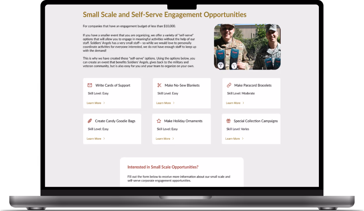
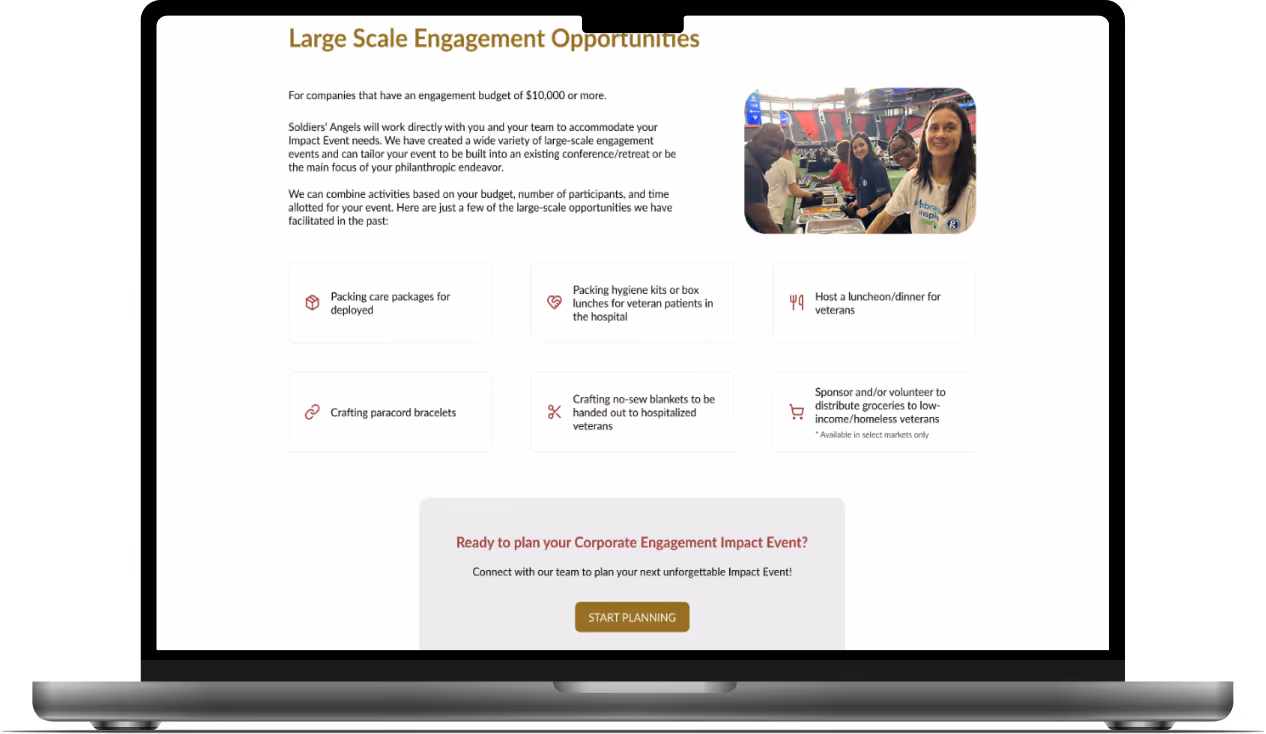
Based on research and persona insights, I redesignedthe page in Figma across desktop, tablet, and mobile breakpoints

Desktop mockup of the corporate engagement page featuring 7 sections, including small-scale, large-scale, and sponsorship-based activities.
Tablet mockup of the corporate engagement page featuring 7 sections, including small-scale, large-scale, and sponsorship-based activities.
Mobile mockup of the corporate engagement page featuring 7 sections, including small-scale, large-scale, and sponsorship-based activities.

Impact

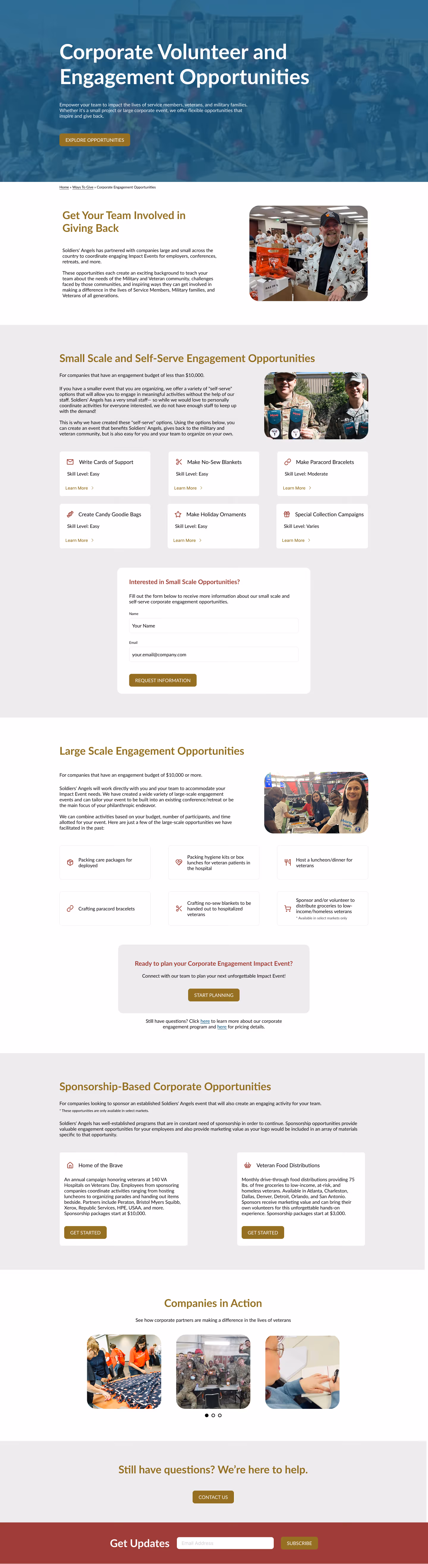
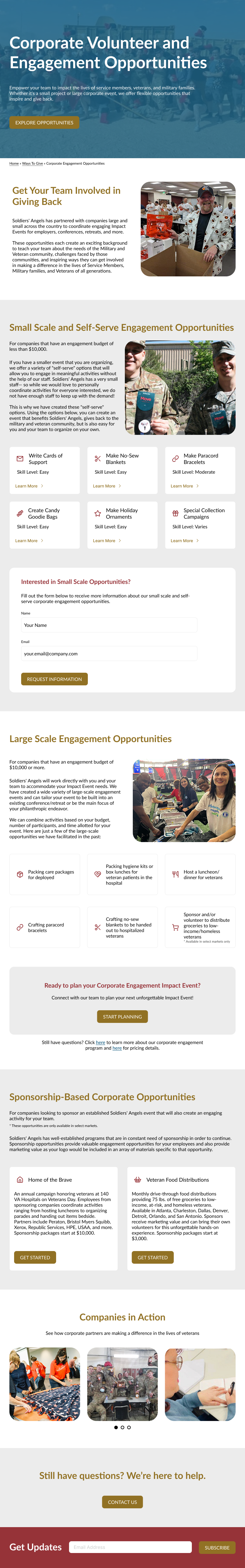
Stakeholders confirmed the redesignaddressed key pain points, improving clarity, messaging, and contentstructure. The streamlined information architecture reduced frictionand made it easier for users to find relevant corporate engagementopportunities. 

Early performance indicators show measurable impact

  • The new contact form placement has already generated several qualified inquiries within the first weeks post-launch, primarily from organizations interested in small-scale engagement opportunities
  • Stakeholders report users are navigating the page more efficiently, with a noticeable improvement in ease of use compared to the previous version​

Ongoing analytics tracking will measure user engagement and conversion growth over thecoming months.

More Case Studies