Client: The Colonel Renee Rubin Private Foundation
Role: UX/UI Designer & Developer
Timeline: 8 weeks
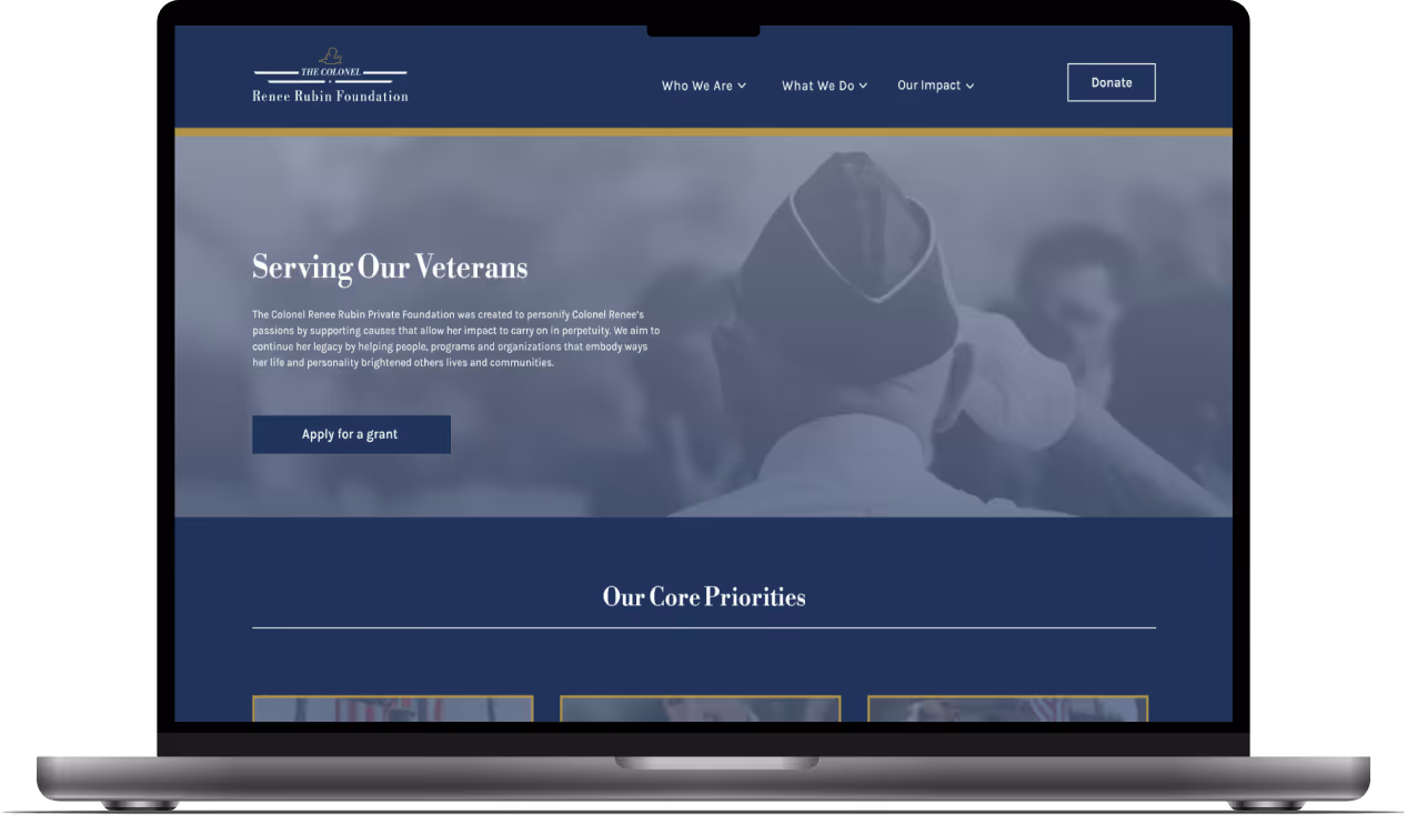
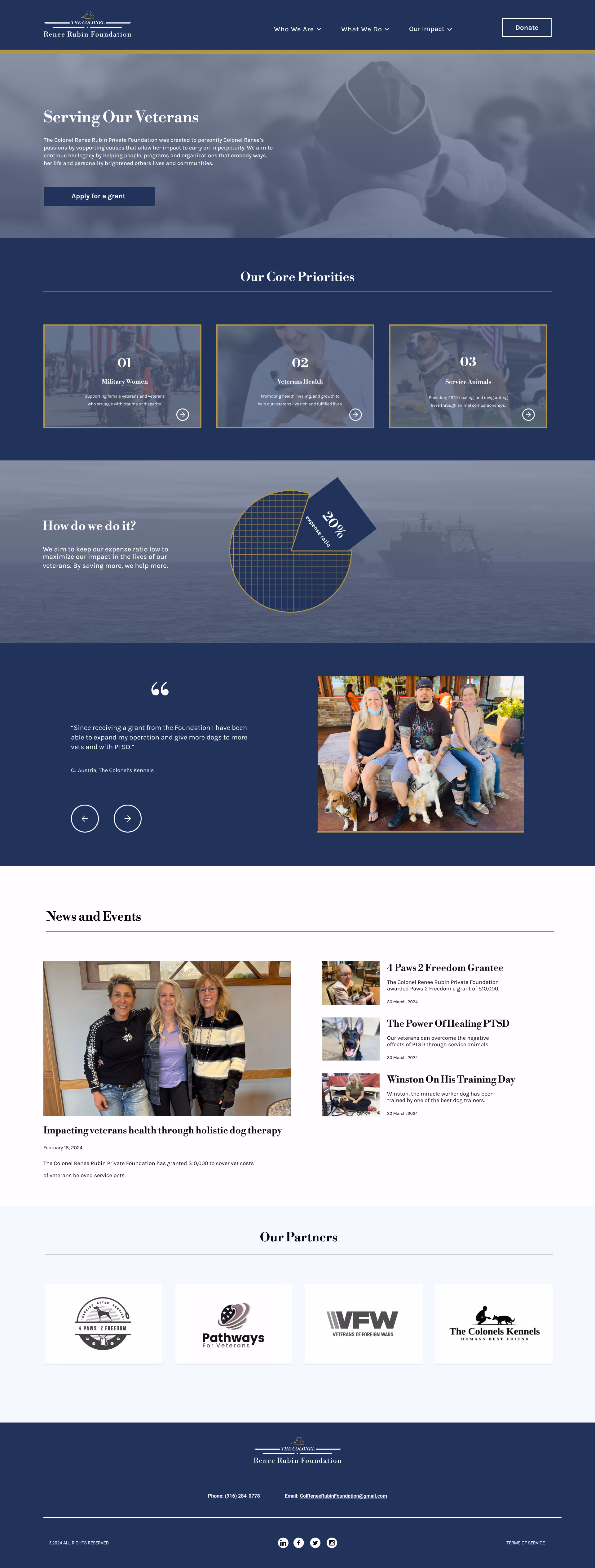
The Colonel Renee Rubin Private Foundation (CRRPF) is a nonprofit organization that provides grants to veterans, with a specific focus on supporting military women and service animals. I led user research, information architecture, wireframes,and high-fidelity mockups before developing the complete WordPress website.
View live siteCRRPF lacked a digital presence to effectively communicate their mission and reach veterans in need of support, limiting their ability to connect with beneficiaries and expand their impact.
Design a website that showcases CRRPF's mission, streamlines the grant application process, and provides accessible resources for veterans, military women, and service animal organizations.
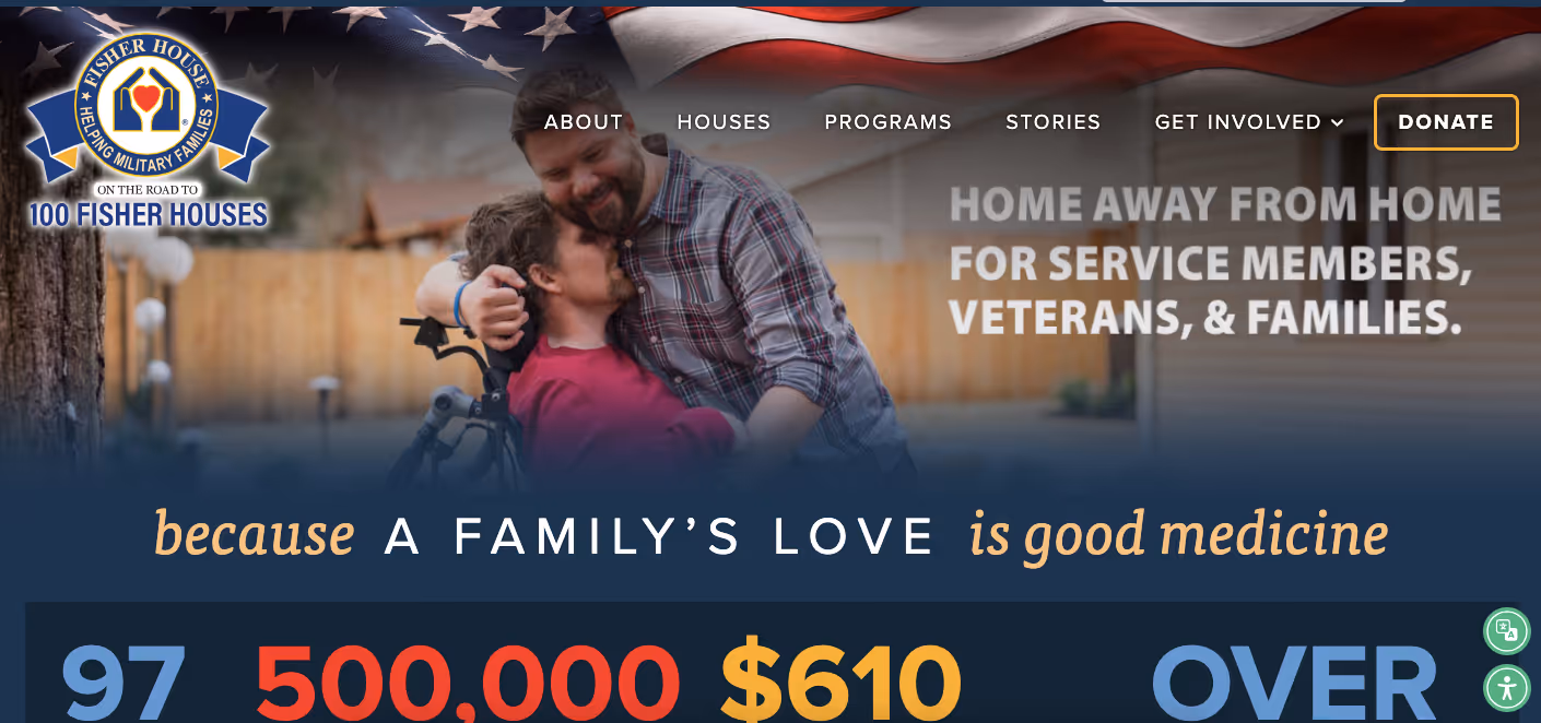
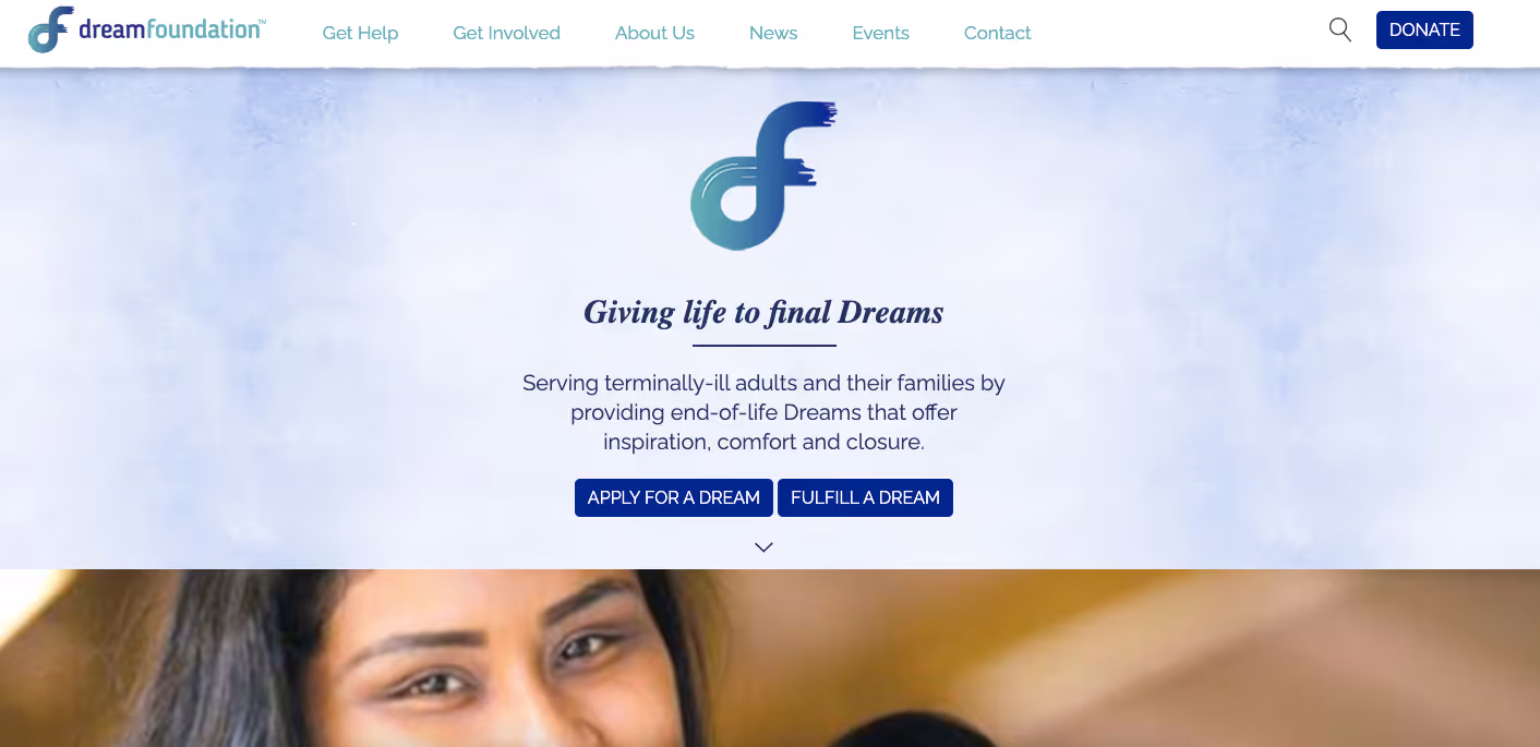
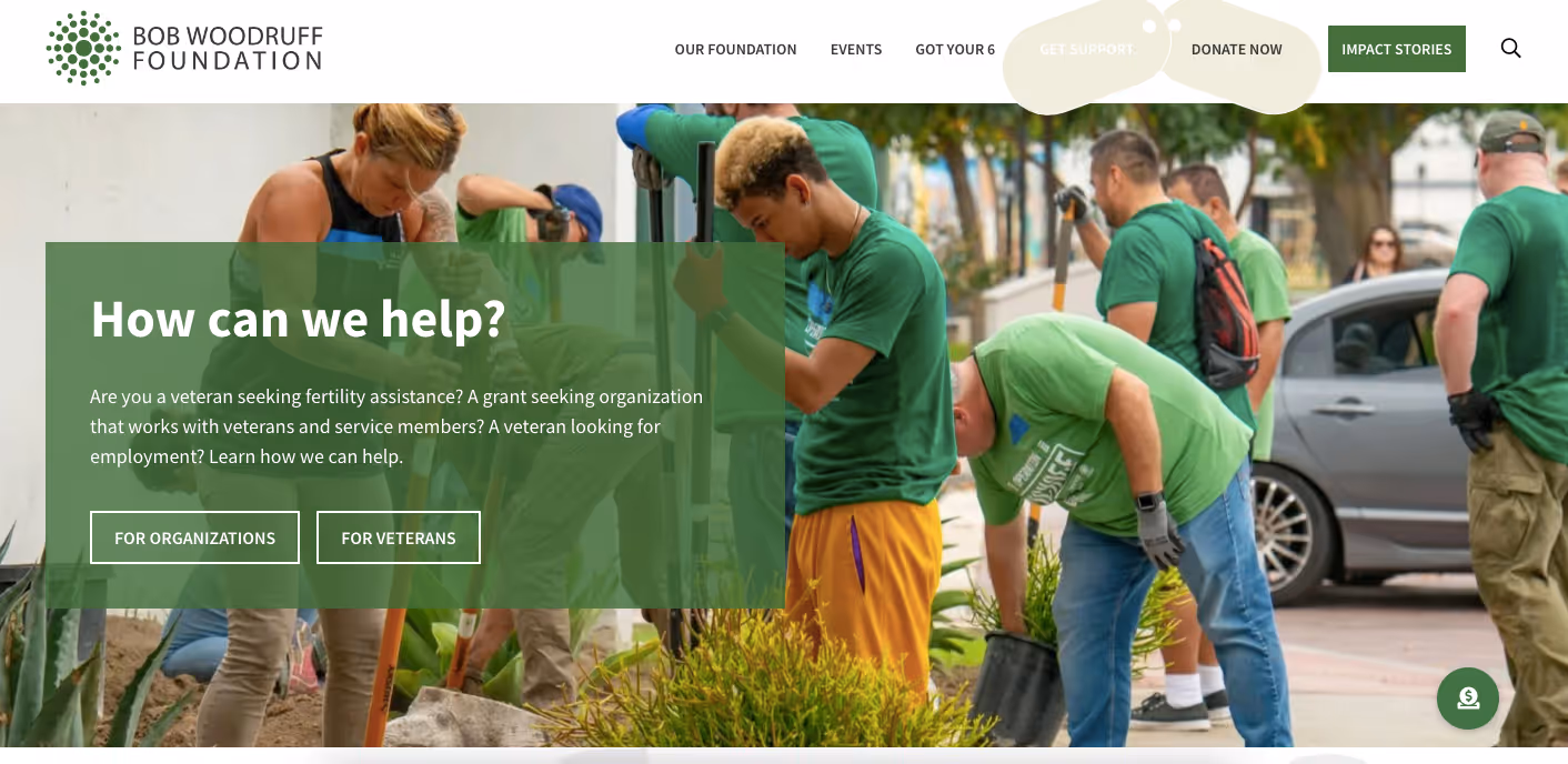
We researched 3 direct and 2 indirect competitors to identify strengths and areas of opportunities. We analyzed the user flows for the grant application and donation process, priority features, and philanthropic site marketing.
Based on our competitor analysis findings, we used the following questions to guide our solution ideation:
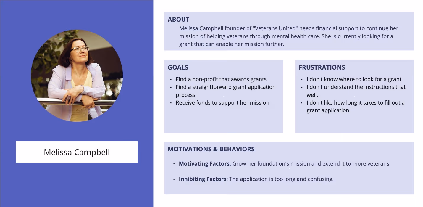
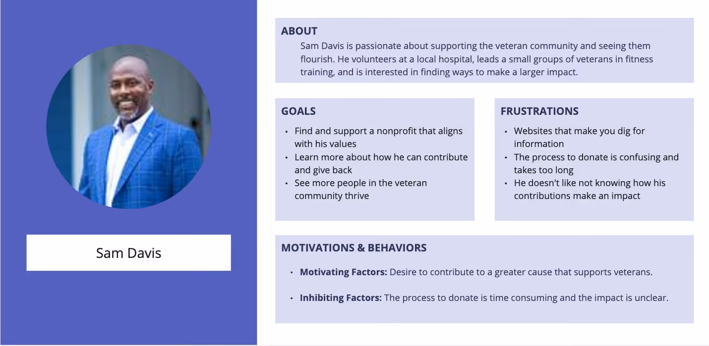
We identified and defined 2 different personas to understand who the users would be.
We created 2 user flows that outlined the key actions users would have on thewebsite. These included:
.png)
.avif)
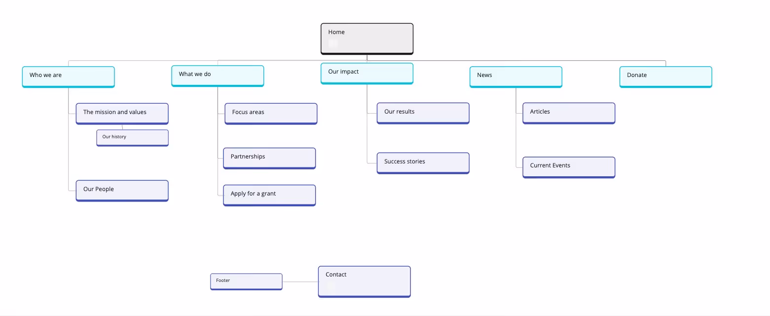
We created a sitemap to provide a clear outline of the website structure for effective user engagement.
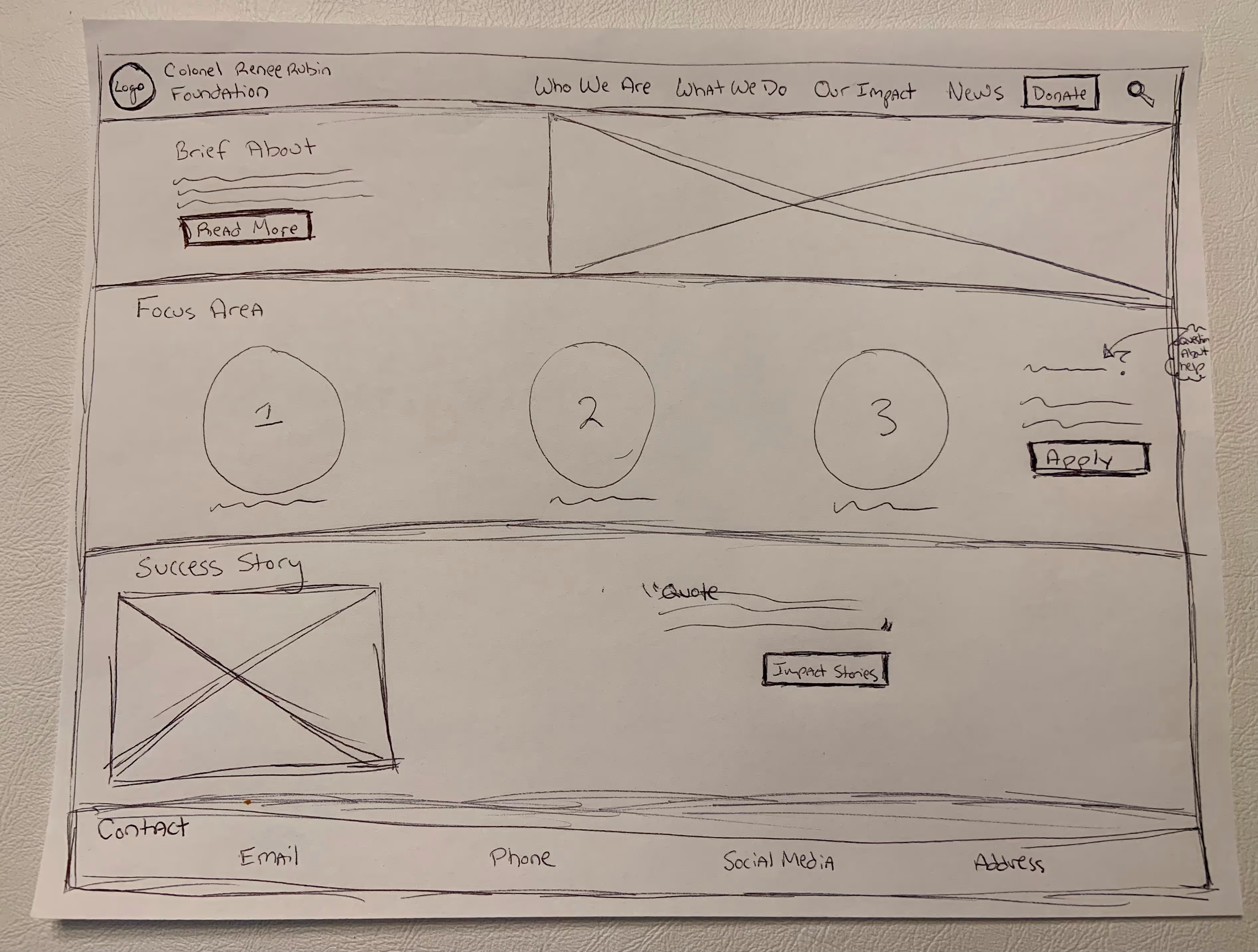
I completed Crazy 8’s to sketch out ideas for the homepage. Then sketched more detail into one option:
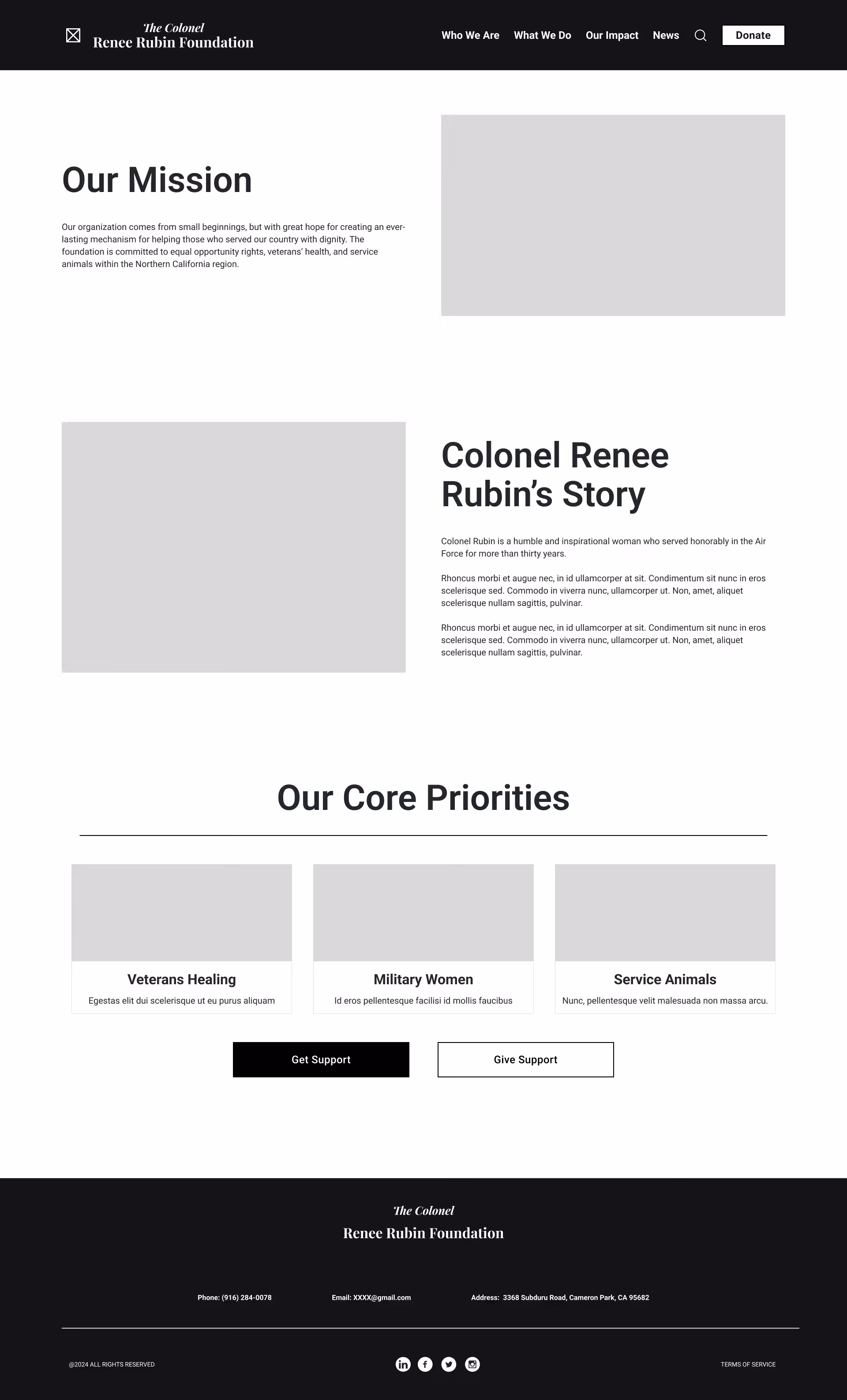
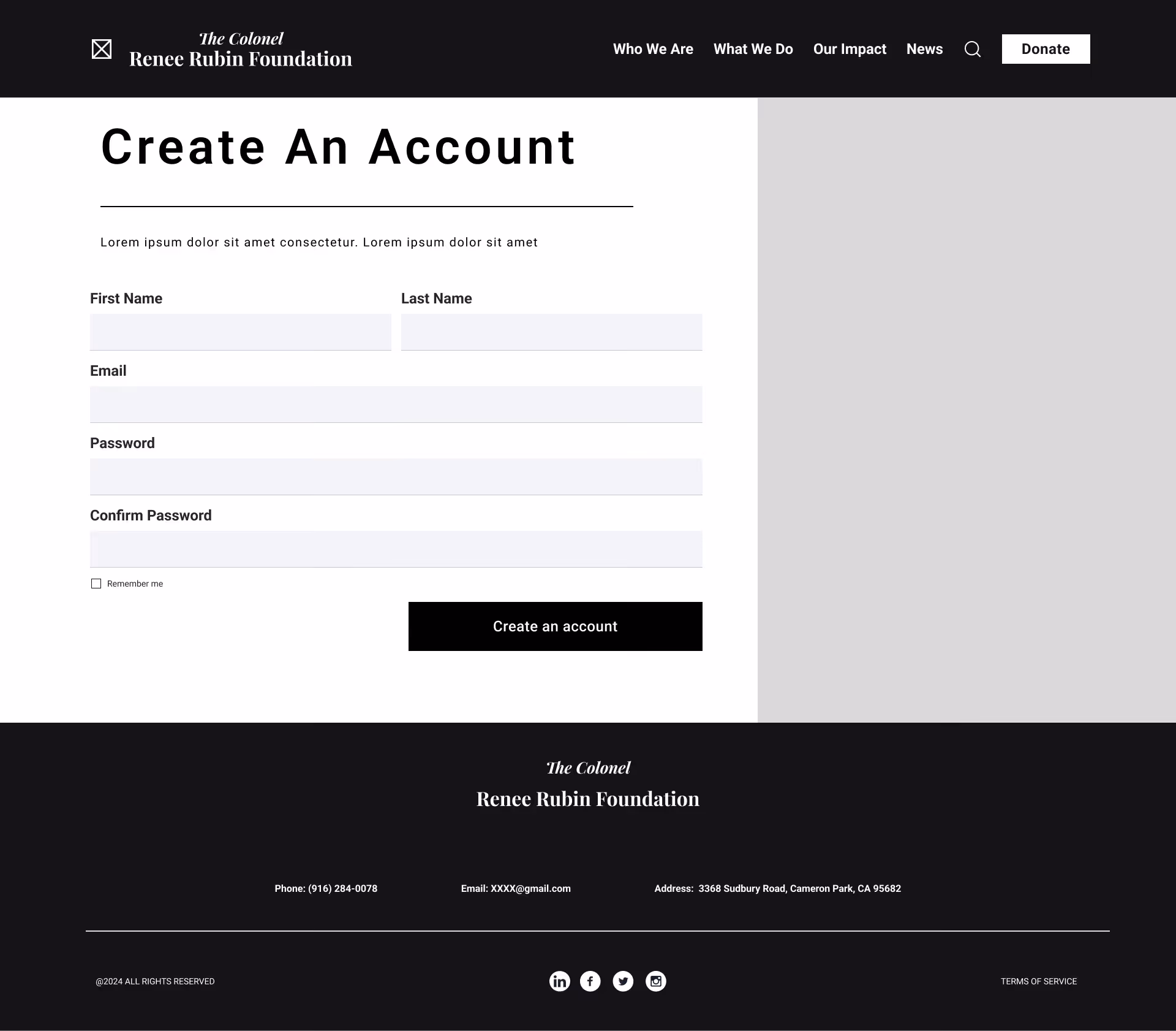
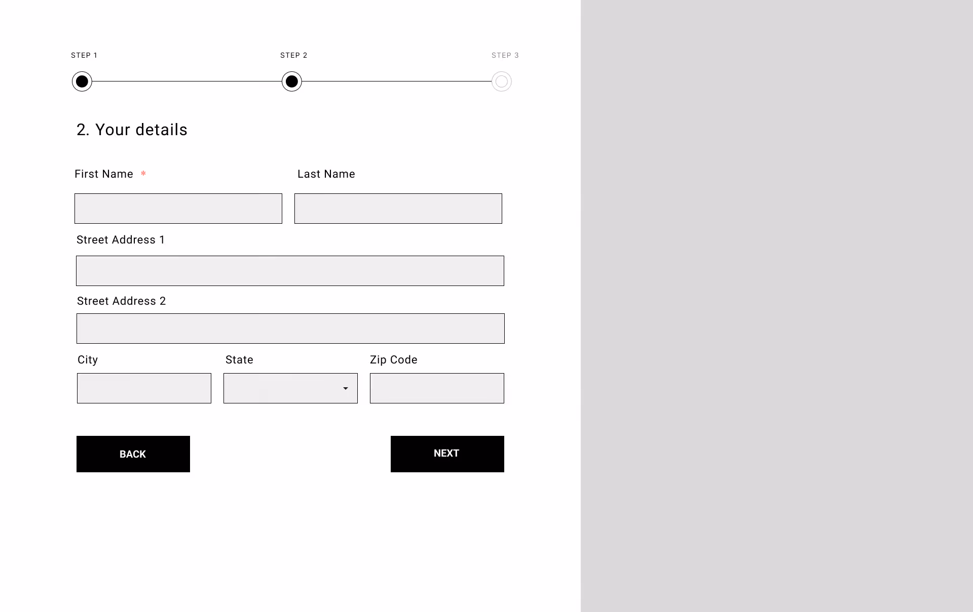
I created wireframes in Figma for Home, Grant Application, The Mission, Our People, and Our Impact pages. Here are 4 of 14 pages:
We conducted moderated user testing with 4 participants to evaluate the grant application and donation processes. Participants completed tasks that tested both user flows.
All participants successfully navigated through both processes and responded positively to the "Our Partners" section on the homepage, the grant application progress bar, and the donation confirmation page.
We identified and addressed 3 key user issues:
Before: Users found the navigation cluttered and difficult to use. The expense ratio was confusing, and the homepage felt too lengthy.
After: We moved the "News" tab under "Our Impact" to streamline navigation, added a clear pie chart for the expense ratio, and simplified the messaging.
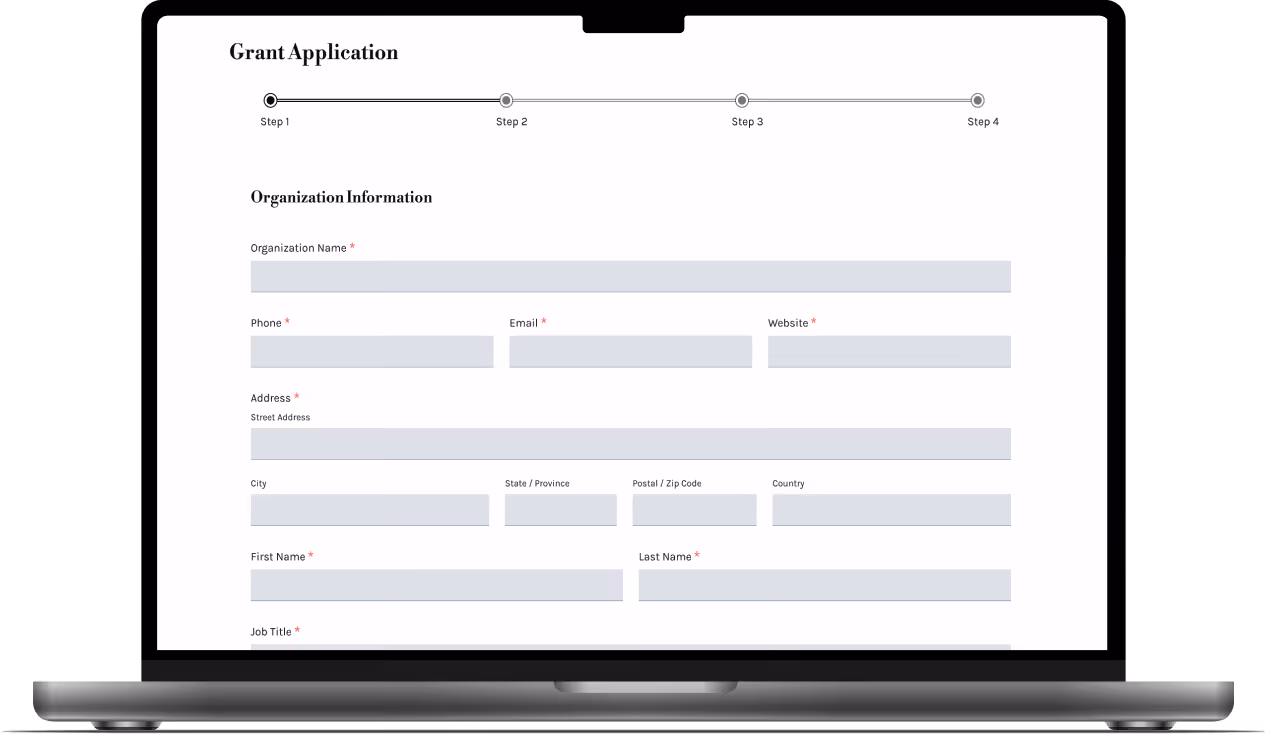
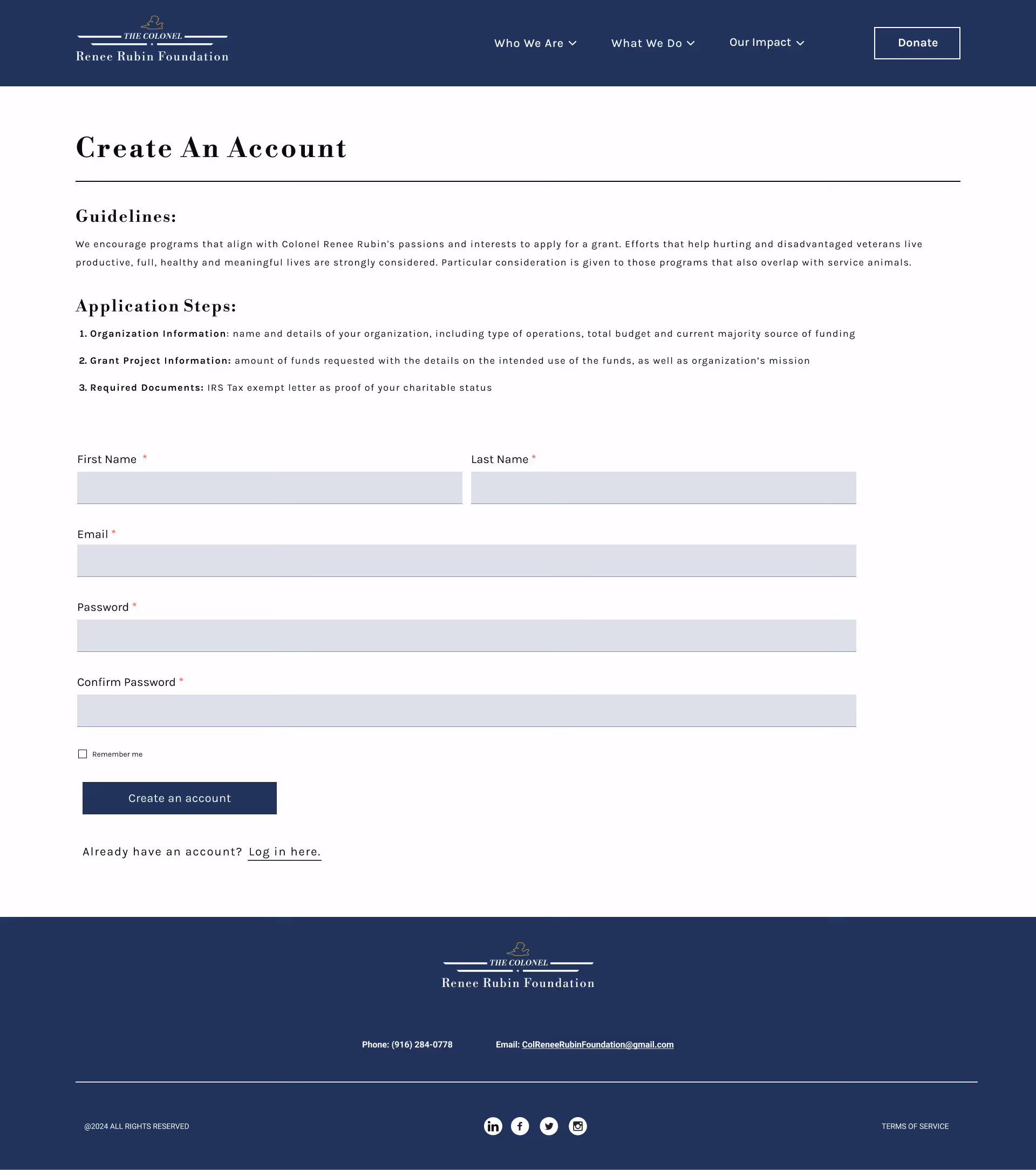
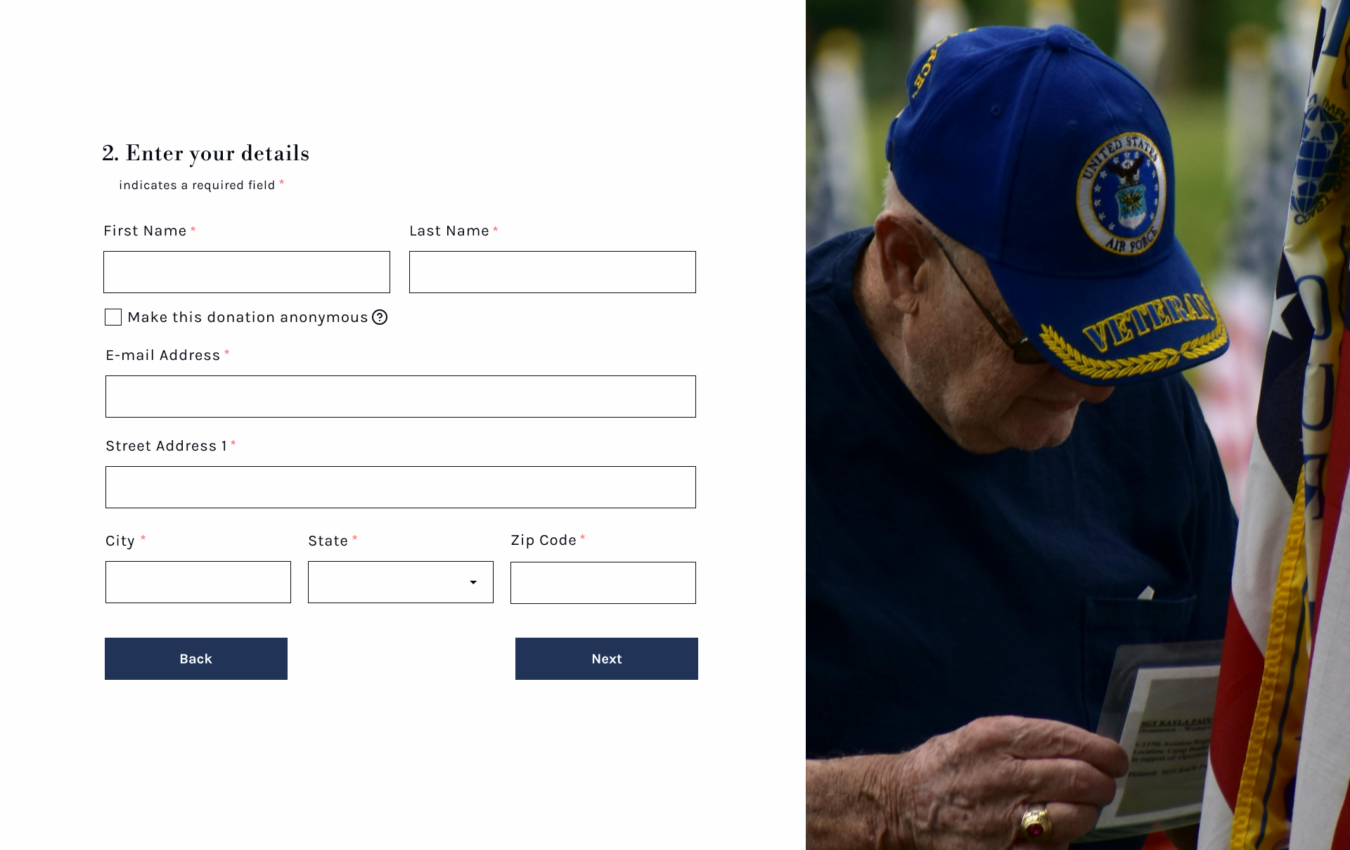
Before: Users lacked clarity on grant application requirements. There was no way to check application status, and the application form didn't indicate which fields were required.
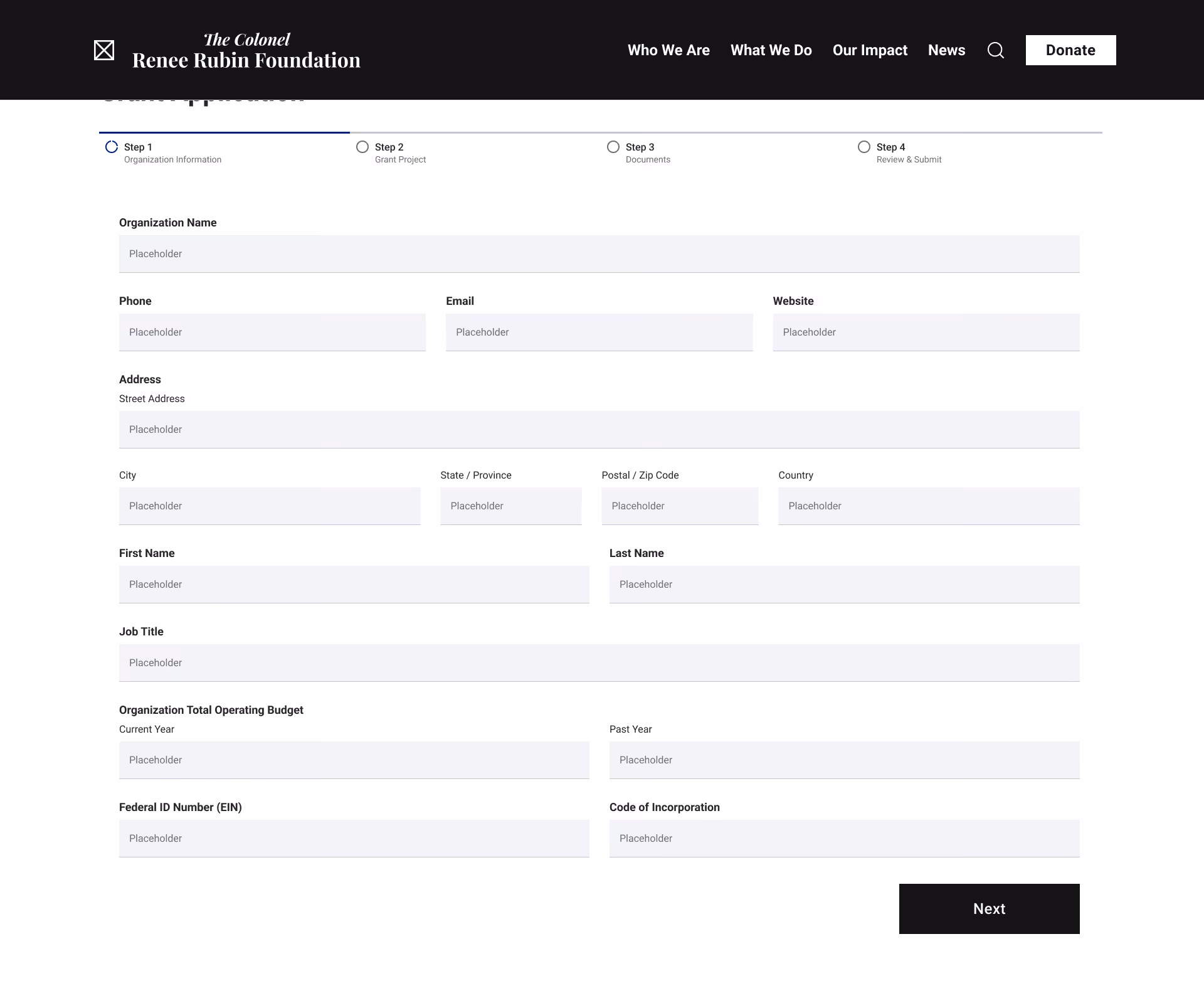
After: We added a requirements list on the "Create an Account" page, created an application portal with status tracking, and marked required fields with asterisks and helper text.
.avif)

Before: Users wanted to make anonymous donations.
After: We added an option to make a donation anonymous.
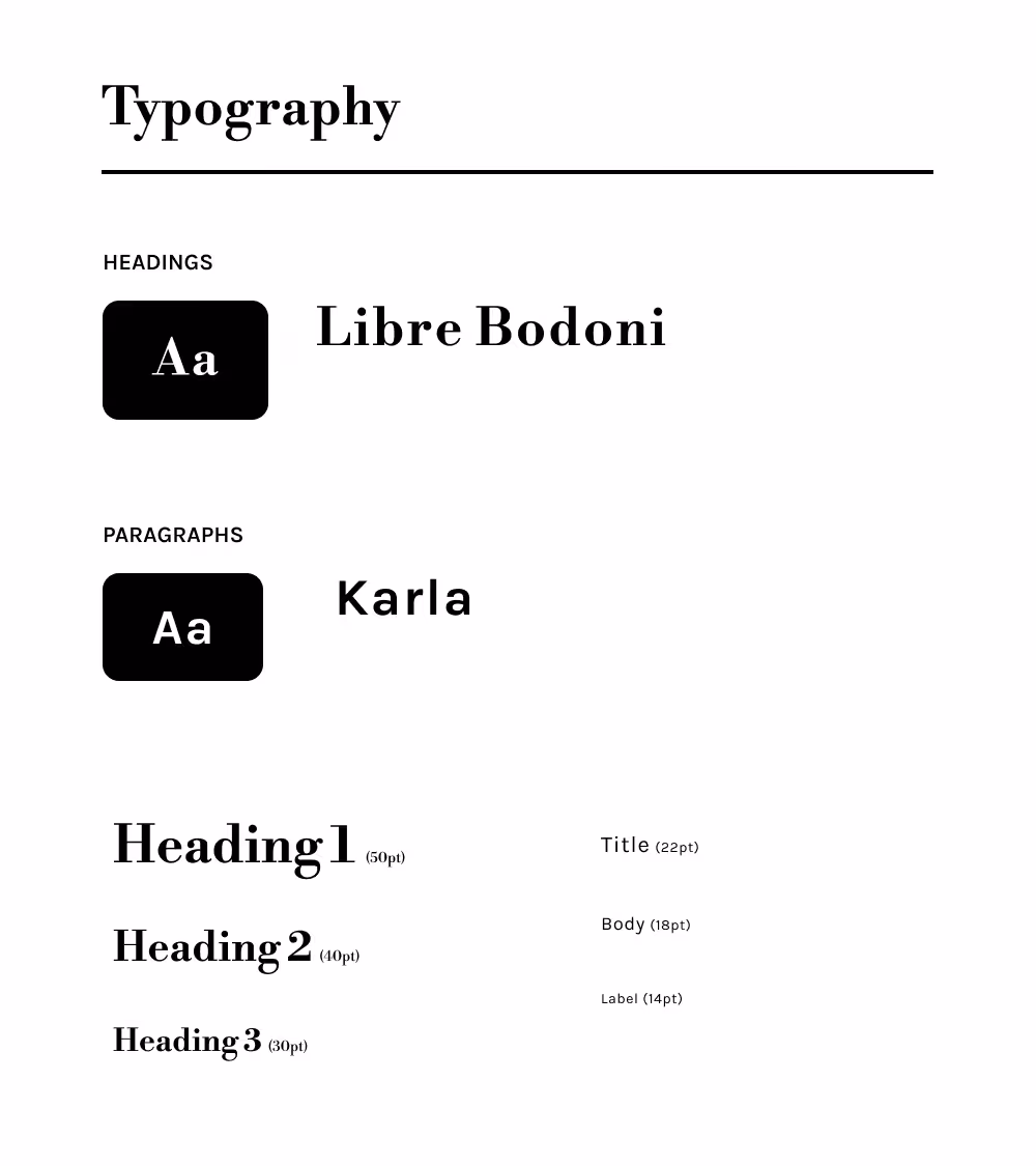
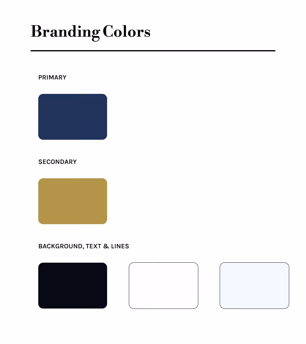
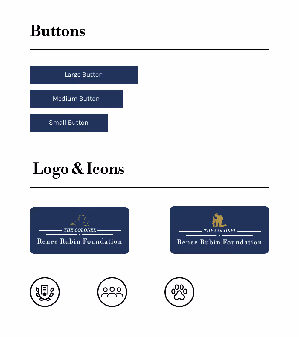
The client wanted a "vintage meets contemporary" aesthetic. We selected dark blue as the primary color to honor veterans and reflect Colonel Renee Rubin's Navy background. To ensure visual consistency, we developed the following style guide:
After user testing, we iterated on our designs, applied the style guide,and created a functioning prototype in Figma. I focused on the user flow forthe grant application, "Who We Are", and "Our Impact". Check it out!
The website was well-received by the board members, who noted it effectively communicates the foundation's mission and streamlines grant applications and donations.
Collaborating with Grecia and The Colonel Renee Rubin Private Foundation was a rewarding experience. I learned so much about color theory during brand development, and initial user testing provided key insights that helped align the designs with client goals.
With a tight timeline, we couldn't conduct user testing after the high-fidelity mockups - a step I'll prioritize in future projects. I also improved my ability to communicate design decisions, which helped maintain visual and functional consistency across pages.
During WordPress development, I learned the importance of having organized content and images for a smoother build process. I gained valuable experience balancing design aspirations with technical limitations, and adjusted the original designs as needed.