Redesigning the Giving Experience
Client: Soldiers' Angels
My Role: UX/UI Designer & Developer
Timeline: 4 weeks

Overview
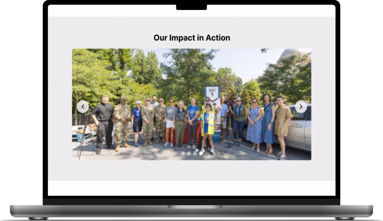
Soldiers' Angels is a nonprofit that supports active military, veterans, and their families.
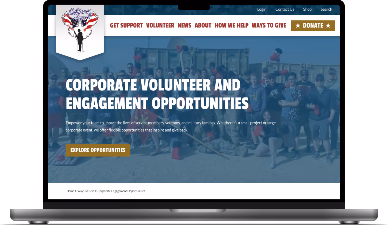
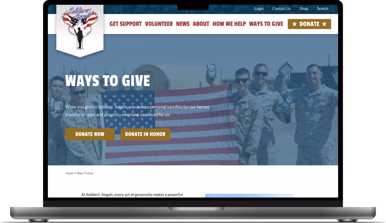
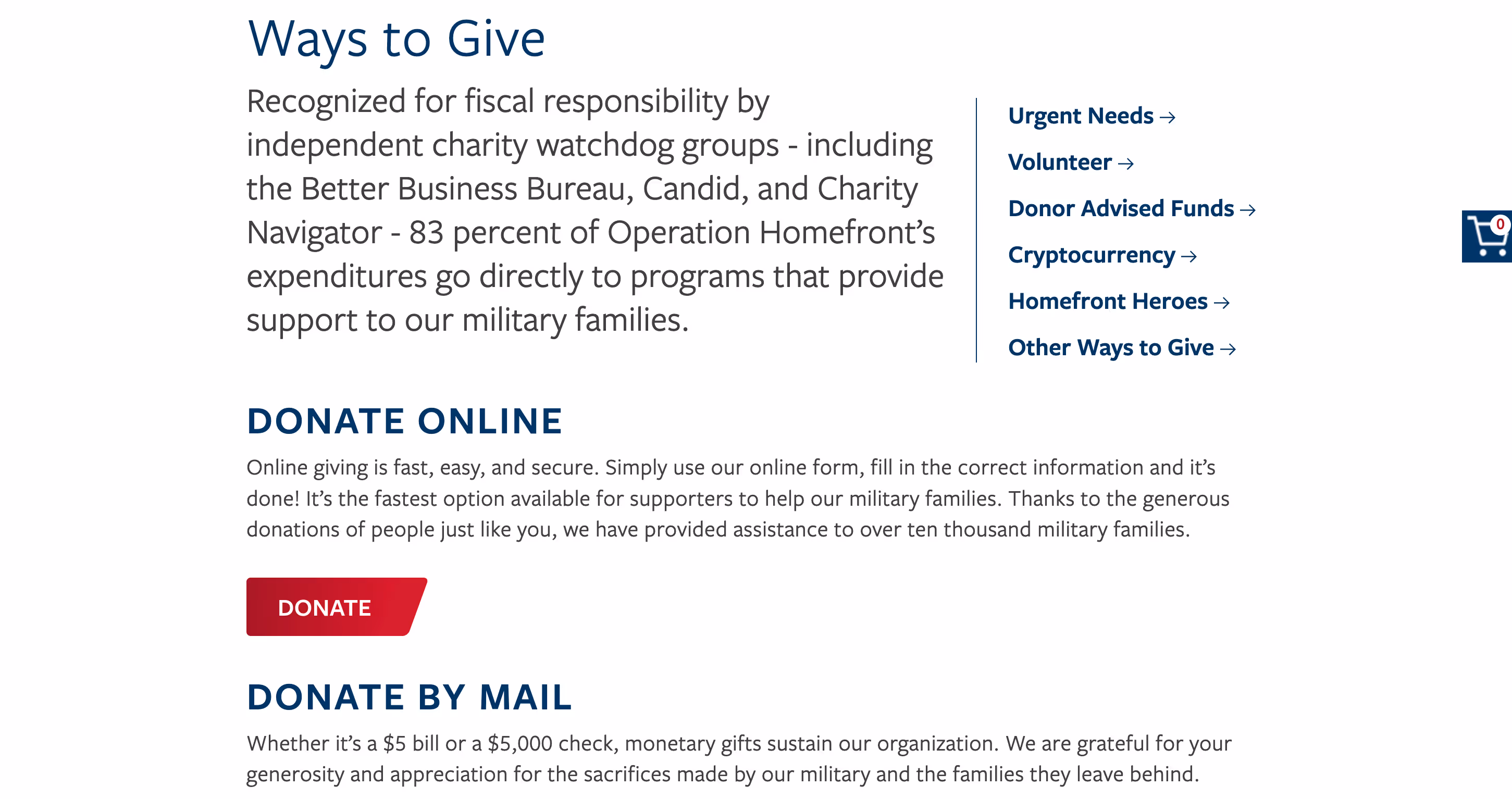
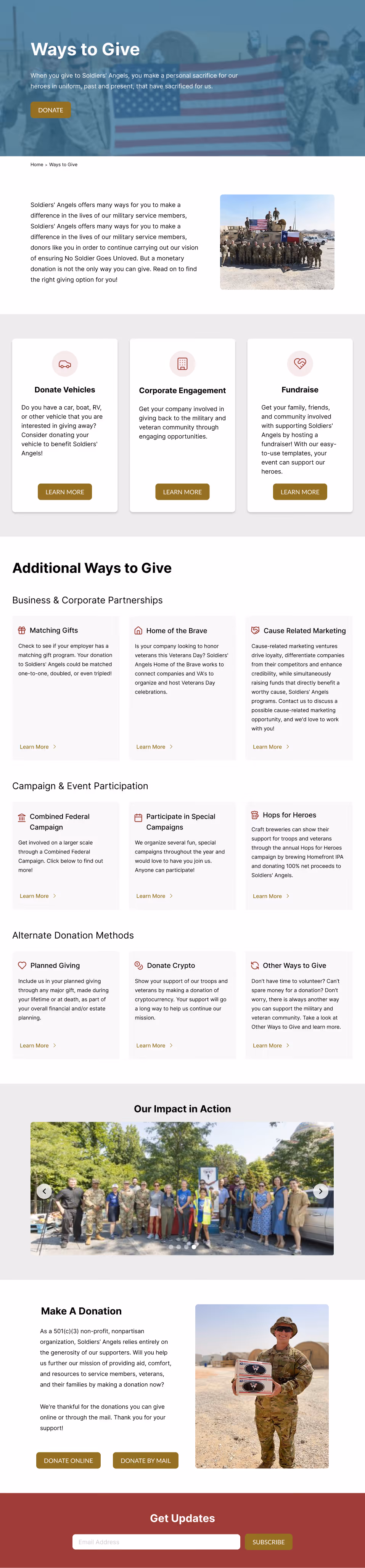
The Challenge
The "Ways to Give" page has an outdated, cluttered layout that creates friction and makes it difficult for donors to take action.
The Solution
Redesign the page with streamlined giving options and clear visual hierarchy to create an engaging, easy-to-use experience that adheres to brand guidelines.
Stakeholder Interview
I met with Soldiers' Angels Marketing Vice President to understand the page's strengths, challenges, and main objectives for the redesign. The key takeaways were:
-
The current layout is cluttered and overwhelming, making it hard for donors to take action
-
Key donation options need to be highlighted so they stand out and area easy to access
-
The page must have clear visual hierarchy and be fully responsive across all devices
-
The redesign must adhere to established branding guidelines
Audit Findings
I conducted a comprehensive audit of the existing page to identify what was working well and where improvements were needed.
What's Working
-
Strong mission-aligned photography
-
Clear donation type descriptions
-
Functional responsive design
Key Issues
-
Hero section is disjointed with poorly positioned breadcrumbs
-
Donation cards have inconsistent design and misaligned CTAs
-
13 alternate giving options are unorganized and overwhelming
-
Multiple CTAs compete and dilute the primary "Donate" action
Recommendations
-
Redesign hero section for better visual cohesion
-
Create one prominent primary "Donate" CTA
-
Organize alternate giving into clear categories, featuring Auto Donation, Corporate Engagement, and Fundraise
-
Move volunteer opportunities to a dedicated section
-
Redesign cards for improved hierarchy, readability, and mobile responsiveness
Competitor Research
I researched 2 direct competitors to identify strengths and areas of opportunities. I analyzed the donation user flow and priority features.


User Persona
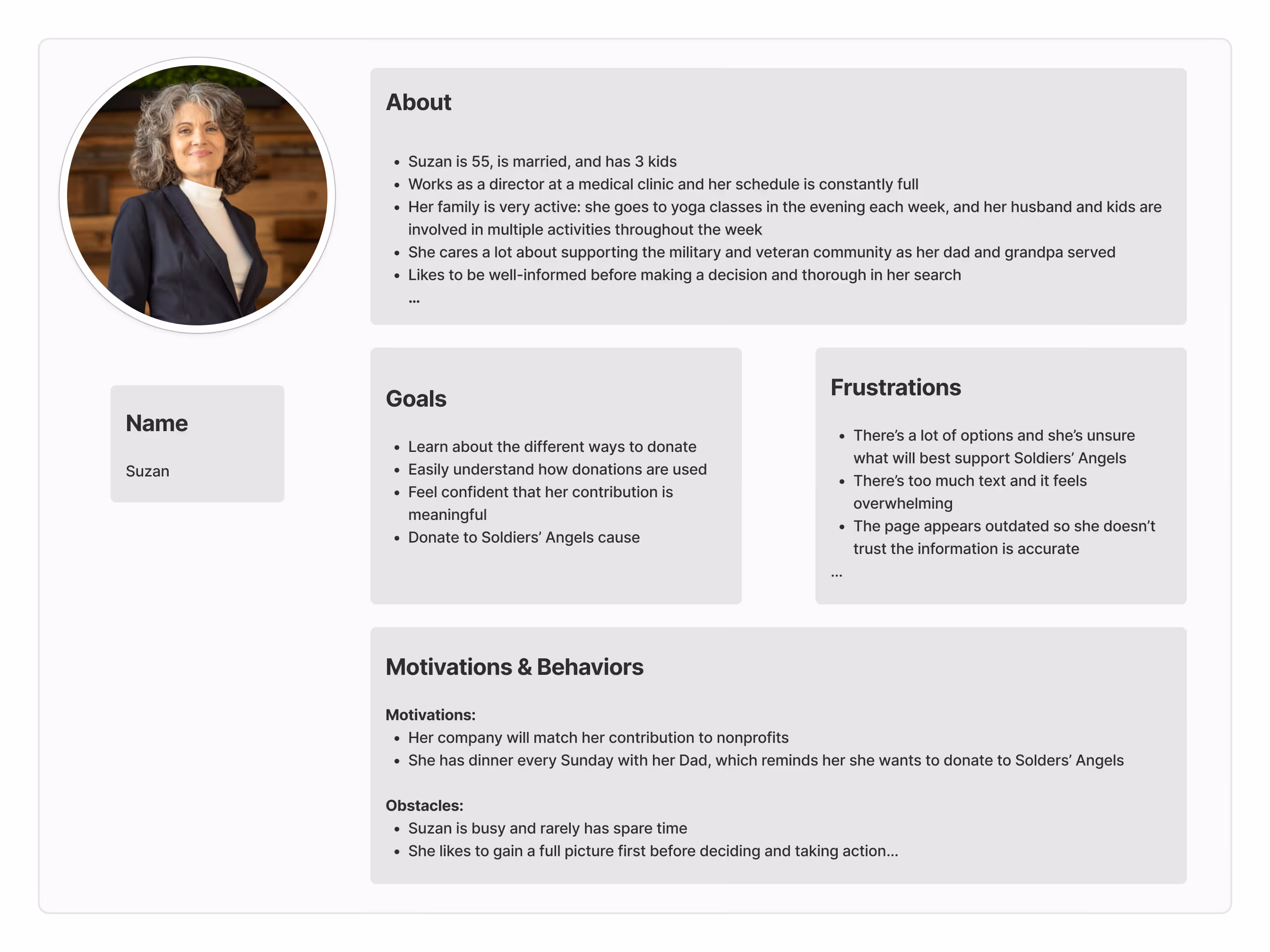
I created a user persona to identify user needs, pain points, goals, and behaviors that would inform the design.

Mockups
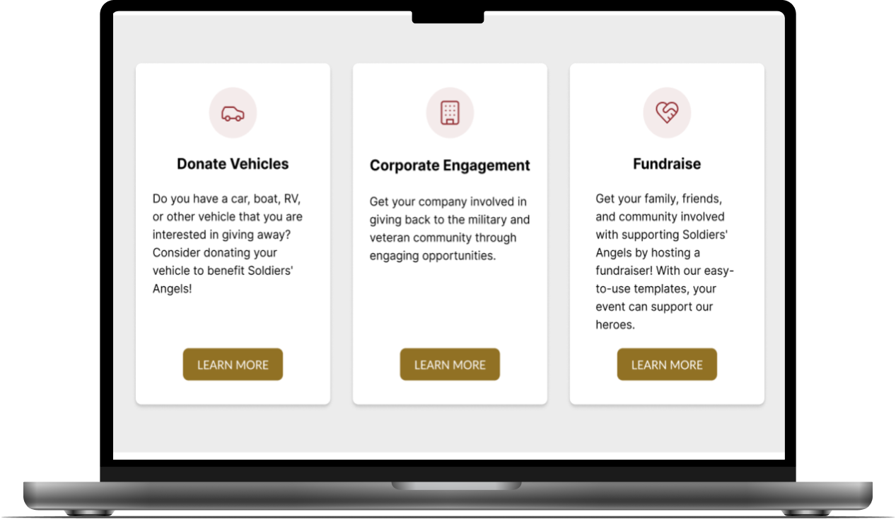
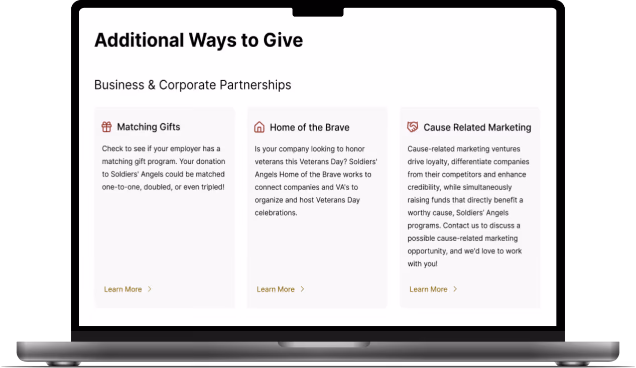
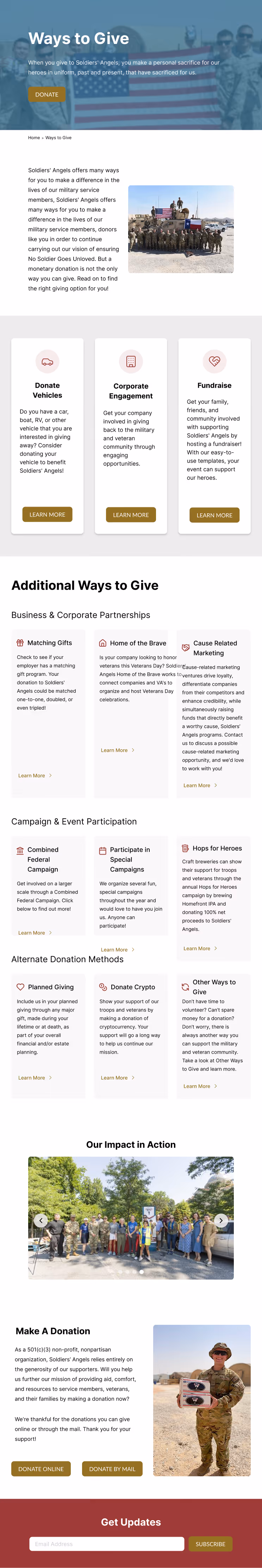
Using research and persona insights, I redesigned the page in Figma. Below are the desktop, tablet, and mobile versions.

Impact
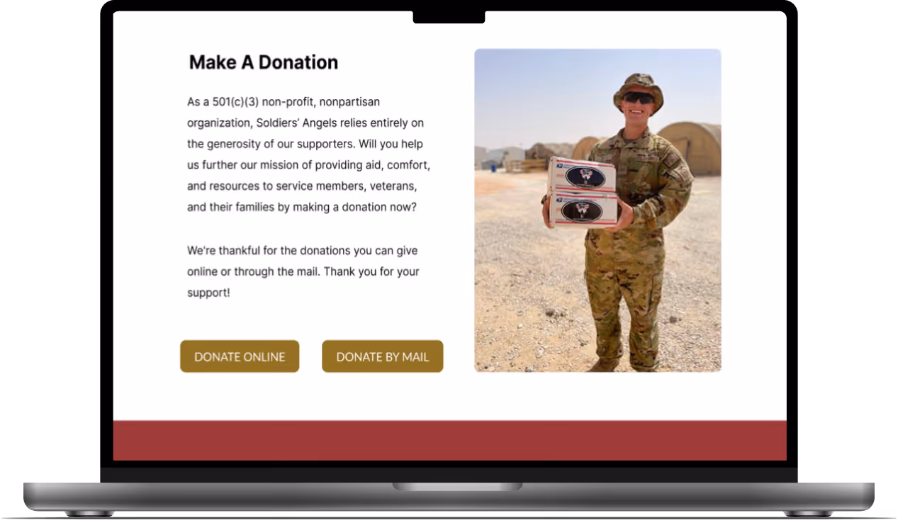
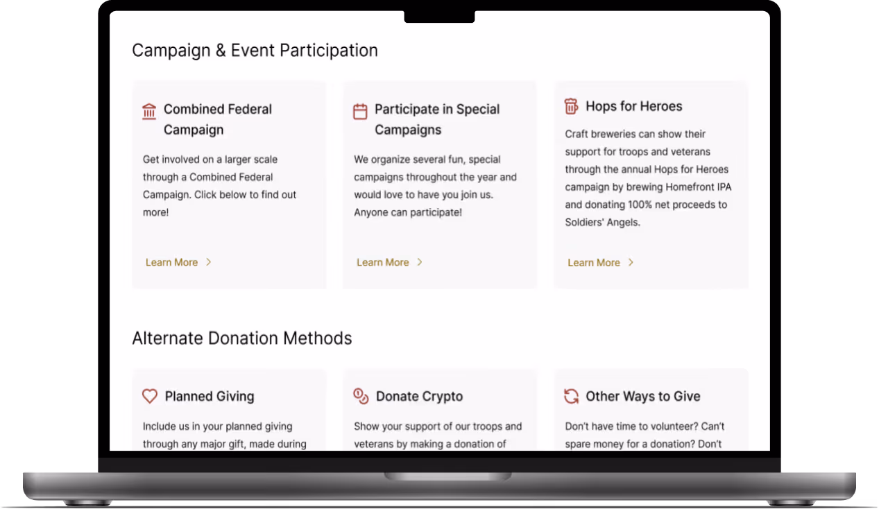
Stakeholders responded positively to the redesign, specifically noting improvements to content hierarchy, card layout, and visual engagement.
Key outcome: Within one week of launch, the client reported increased user engagement attributed to the improved flow.


